Monday, April 29, 2013

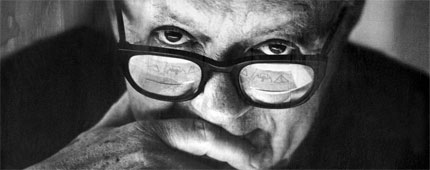
Paul Rand


Logo's are a very integral and important part to any company because they give off the initial first impression of your company when someone sees your logo. To me a successful logo is simple yet can explain a lot about your company or how you want your company to be perceived. Paul Rand is the king of logo making, and has made some of today's biggest companies logos. Some of Rand's most famous work had been for Steve Job's NeXt, IBM, Enron, and UPS.
To me Paul has really taken the overall essence of each company and transformed each into a simple yet intriguing logo. Rand does not believe that there needs to be a lot going on in a logo or design for it to be successful, and that most of the time the simple design often conveys the message better and diverts all attention onto the logo. Paul Rand was also one of the originators of the Swiss style of design, his works for ABC and Westinghouse were also staple "Rand" designs.


Here are some of Paul Rand's iconic and famous logo's of the 20th century. Rand really captures what each company is all about, with simple subtle designs. The UPS design always stuck out to me, the box with a bow on the top of the UPS symbol almost makes you want to receive a package. The lines through the IBM almost give off a look that you are actually looking at a computer screen.


Sunday, April 28, 2013

Posters have been used for a long time to convey messages to the public, they can be a very effective way in my opinion to evoke a feeling in someone by either displaying a message or an advertisement. There are many famous posters from American history that really stick out in my mind as effective and outstanding such as the famous Uncle Sam "We Want You" poster.
One poster that I always liked was J. Howard Miller's, "WE CAN DO IT!" design from the 1940's. This was a poster made during the absence of a lot of the men in the war, to boost the morale of the women and empower them in the workplace. At this point in American history women did not have the same rights as they did today, this poster was a voice for the women to speak up and say, "hey we can do this!"
This poster is often times called "Rosie the Riveter" who was actually an strong iconic female production worker of the time. One interesting fact about this poster was that during World War II, this poster was no where near as famous as it is today. The poster made a come back in the 1980's when people started using the poster to promote feminism, and other woman's rights issues. This is the beauty of this poster, which at the time was aimed to encourage already heard working women to continue working, and now is used all over the world to promote women in all senses. The bright colors of the poster drag in your attention today as much as I am sure it did in the 40's, the woman in the picture shows strength and confidence, with possibly grungy clothing, yet a pretty made-up face.

Tuesday, April 9, 2013

Noma Bar

Noma Bar is a very interesting graphic designer to me and someone who's designs truly inspire and make me think. Bar works mainly in Europe as he lives in Great Britain, (was born in Israel) and has created designs for Time Out London, The Observer, and England's famed BBC. Bar's work inspires me because she uses very simple graphics and ideas but creates underlying visions or messages in her designs. Although he has made many ingenious designs for companies, he draws a thin line between designing graphics and making artwork. Noma has over 500 illustrations and prints that are for sale as art, mostly of his famous abstract face design to many different celebrities and movies.
Something Noma Bar gas become very famous for is his use of negative space in his designs, which I find very interesting. Some of his designs are over 80% white space yet portrays a crisp and powerful image or meaning.
 This is a recent design of Bar's for a Japanese author, it is a great example of Bar's incredible use of negative space, which in this case creates a cat and a face all in one.

 This is another very famous design from Bar. This was one of his first designs he made, creating Sadam Hussein's face out of the bio hazard symbol. It is truly ingenious how he incorporates such strong messages into his designs, while using very simple designs. This image made Noma very popular, for the way he captured Sadam's face and mustache, while portraying the message of danger and hazard, which we all know went hand in hand with Mr. Hussein.


 These too are some of Noma's very powerful and famous designs capturing (from top left to right) boxing gloves which also show a muscular man in the negative space, Adolf Hitler, Pulp Fiction, and Kim Jong Li. All extremely powerful in their own ways.

Thursday, April 4, 2013

While working on Project 2 I began to realize a lot of basic things about designing a lay out for a magazine. One thing that continued to stick out in my mind is that less is more a lot of the time. Meaning, at first I wanted to flood my pages of my magazine lay out with colors and pictures, but when I did it completely took away from the text which is the whole purpose of a magazine article. I began thinking about magazines that I read and things that catch my eye and make me continue reading. I realized that to me, an appealing article was a crisp and clean lay out with pictures that related to the text but no more than 2 pictures per page. If the text in the article is written over certain colors, it can take away from the text or make it harder to read and focus.